Create a full screen menu in squarespace for both desktop and mobile
Most Squarespace templates show a traditional navigation bar on desktop and switch to a hamburger menu on mobile. It works, but it's not always what you want. If you're going for a more editorial, portfolio, or minimal look, having the same burger menu trigger on every device — opening a full screen overlay or half screen, gives your site a much more intentional feel.
The code
/* Full Screen menu on Desktop / mobile - sqspguru.com */
/* Hide desktop nav */
body:not(.sqs-edit-mode-active){
  .header-nav {
    display: none;
  }
  /* Hide header button */
  .header-actions {
    display: none;
  }
  /* Show burger icon on all devices */
  .header-burger {
    display: flex;
  }
  /* Show full screen overlay when menu is open */
  &.header--menu-open .header-menu {
    opacity: 1;
    visibility: visible;
  }
}
Once saved, your desktop navigation links disappear and the hamburger icon takes over on every device. Clicking it opens the full screen menu overlay you'd normally only see on mobile.
How to add
Step 1
Go to Custom Code → Custom CSS in your Squarespace panel
Step 2
Paste the code at the bottom of any existing CSS
Step 4
Click Save and preview on a mobile device
Show the Menu as a Side Panel on Desktop
A full screen menu on a 13-inch laptop is fine. On a 27-inch monitor it can feel like a lot. If you want the menu to take up only half the screen on larger devices.
@media only screen and (min-width: 767px) {
  .header--menu-open .header-menu {
    width: 50%;
    box-shadow: 4px 4px 14px 2px rgba(0, 0, 0, 0.66);
    margin-left: 50%;
  }
}
This makes the menu panel take up the right half of the screen on anything wider than 767px, with a soft drop shadow to separate it visually from the page content behind it.
Burger icon on the left, logo in the center
If you prefer the burger icon on the left side of the header with your logo centered, you'll need to do two things.
First, go to your Header settings and select the layout that places the burger on the left and logo in the center — it looks like this:
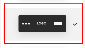

Then add this CSS:
.header-display-desktop {
  flex-direction: row-reverse;
}
And update your half-screen menu code to remove the margin-left: 50% so the menu comes in from the left instead of the right.
Final Result
Once saved, every visitor regardless of device will see the burger icon in your header. Clicking it opens a clean full screen or half screen menu overlay, depending on which version of the code you use. Your desktop nav is completely hidden, keeping the header minimal and the experience consistent across all screen sizes.
Take it further with the Desktop Drawer Navigation plugin
If a basic side panel feels a little plain, the Desktop Drawer plugin adds a smooth animated slide-in with hover effects you just can't get with CSS alone.